Bundled
Dashboard user centric design which aimed at reducing friction and improving discoverability across website.

Overview
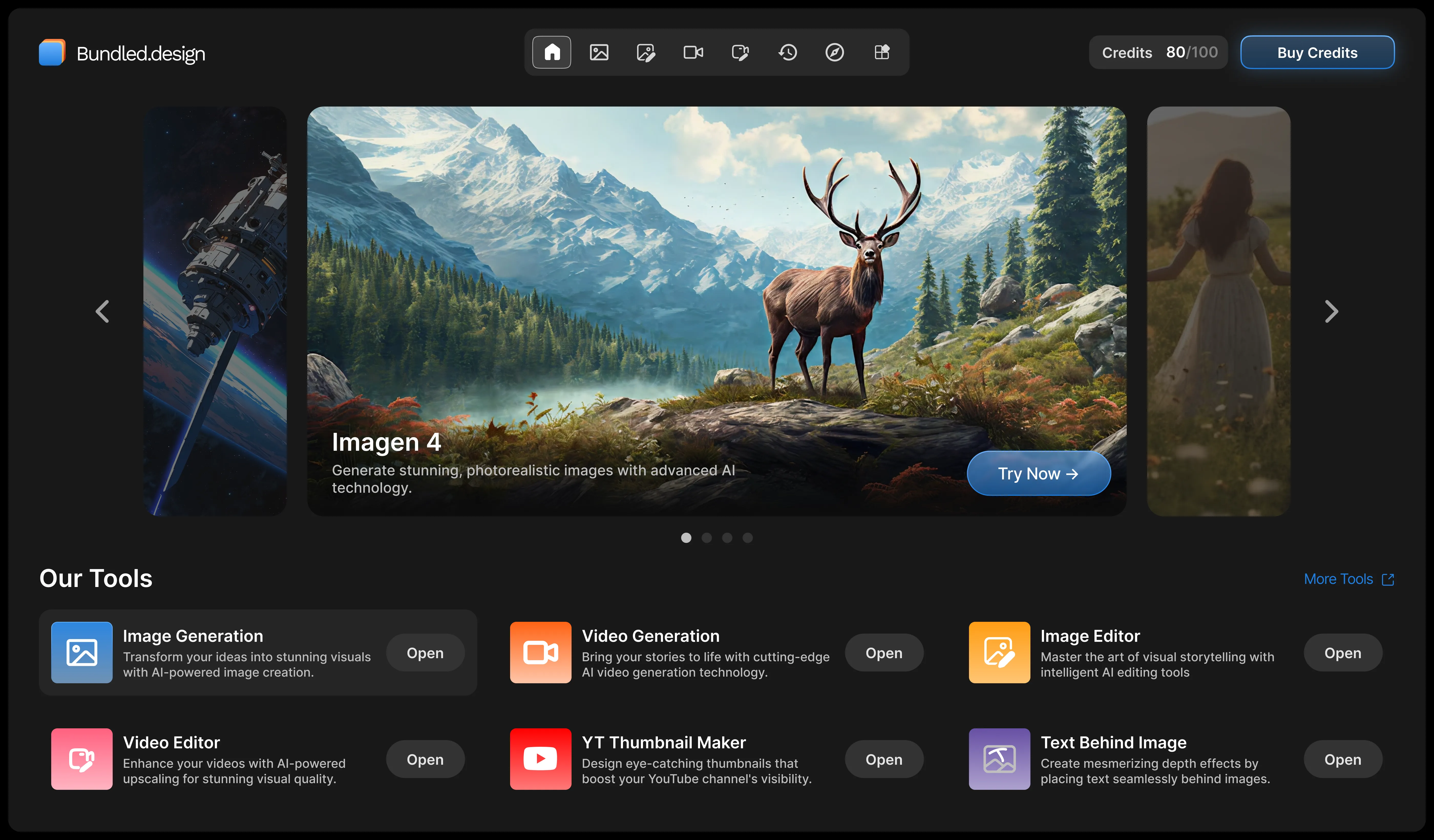
Bundled.design is a creative platform built for the Gen-AI space. I designed the AI Tools Dashboard a homepage that brings a suite of image, video, and text generation tools into a single, cohesive interface. The goal was simple make a homepage from where user can easily access the most AI tools and inspirations.
Problem Statement
Generative AI tools were multiplying faster than users could keep track of. Creators were bouncing between disconnected platforms for multiple generation tools no shared navigation, no consistent experience, no single place to discover what was available.
Goals
Discoverability: - engagement across the tools increased by 32%
Engagement: - average session duration grow by 24%
Satisfaction: - reach a 4.1+ user rating post-launch
Approach
I started with a visual-first hypothesis: on a creative platform, the interface itself should feel like proof of what the tools can do. That shaped two early decisions:
A card-based system for organising tools, so new additions could scale without redesigning navigation
A prominent content gallery surfacing real user-generated work, turning the homepage into inspiration, not just a menu
From there, the process moved from low-fidelity wireframes (structure and hierarchy) to high-fidelity Figma mockups (a dark, modern UI designed to let visual content lead).
Key Design Decisions
Organising complexity without clutter. With dozens of tools to surface, minimalism and completeness were in direct tension. I resolved this with a filterable, top-level navigation (Image / Video / Text) paired with a card grid letting users narrow scope instantly instead of scanning everything at once.
Designing for content, not just UI. High-resolution images and video needed to be first-class citizens of the layout, not squeezed into fixed containers. That meant building a responsive grid system that could hold visual weight across breakpoints without breaking the layout.
Typography and color in service of content. The dark theme was chosen deliberately engaging enough to feel premium, restrained enough to let user-generated visuals stay the focal point. Type was tuned for contrast and legibility against that background.
Outcome
Post-launch metrics beat every target:
Goal | Target | Result |
|---|---|---|
Tool engagement | +24% | +26% |
Satisfaction rating | 4.1+ | 4.4 |
Reflection
The biggest takeaway was how much a visual-first layout reduces cognitive load when the interface shows rather than lists, users navigate by recognition instead of reading. I also learned how much earlier collaboration with engineering saves later:) understanding technical constraints on responsive media handling shaped decisions I would've otherwise made blind.
Final Outcome
The final design is a user-friendly and visually appealing dashboard that successfully organizes a suite of generative AI tools. The intuitive interface allows for easy navigation, and the prominent gallery inspires users by showcasing the platform's capabilities.
A few notes on what I changed and why:
Cut narrative connective tissue ("We brainstormed...", "This was addressed through...") in favor of direct, decision-first sentences, that's the register most product design case studies use.
Added a results table since recruiters/reviewers scan for numbers fast.
Reframed "Challenges and Solutions" as "Key Design Decisions" same content, but it reads as deliberate reasoning rather than problem-solving after the fact.